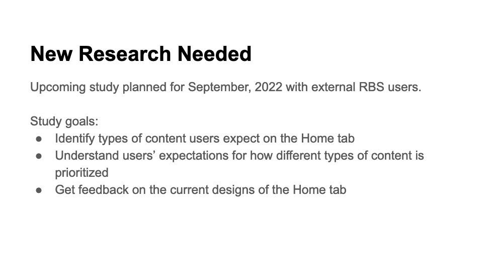
Overview
|
This project focuses on creating content for the launch of a new app (Facebook View) to support a smartglasses wearable device (Ray-Ban Stories). The work focused on designing a new-user flow, feature awareness, settings architecture, and a product tour. This project was challenging because I was tasked with creating content in an app to drive usage of a device.
Situation
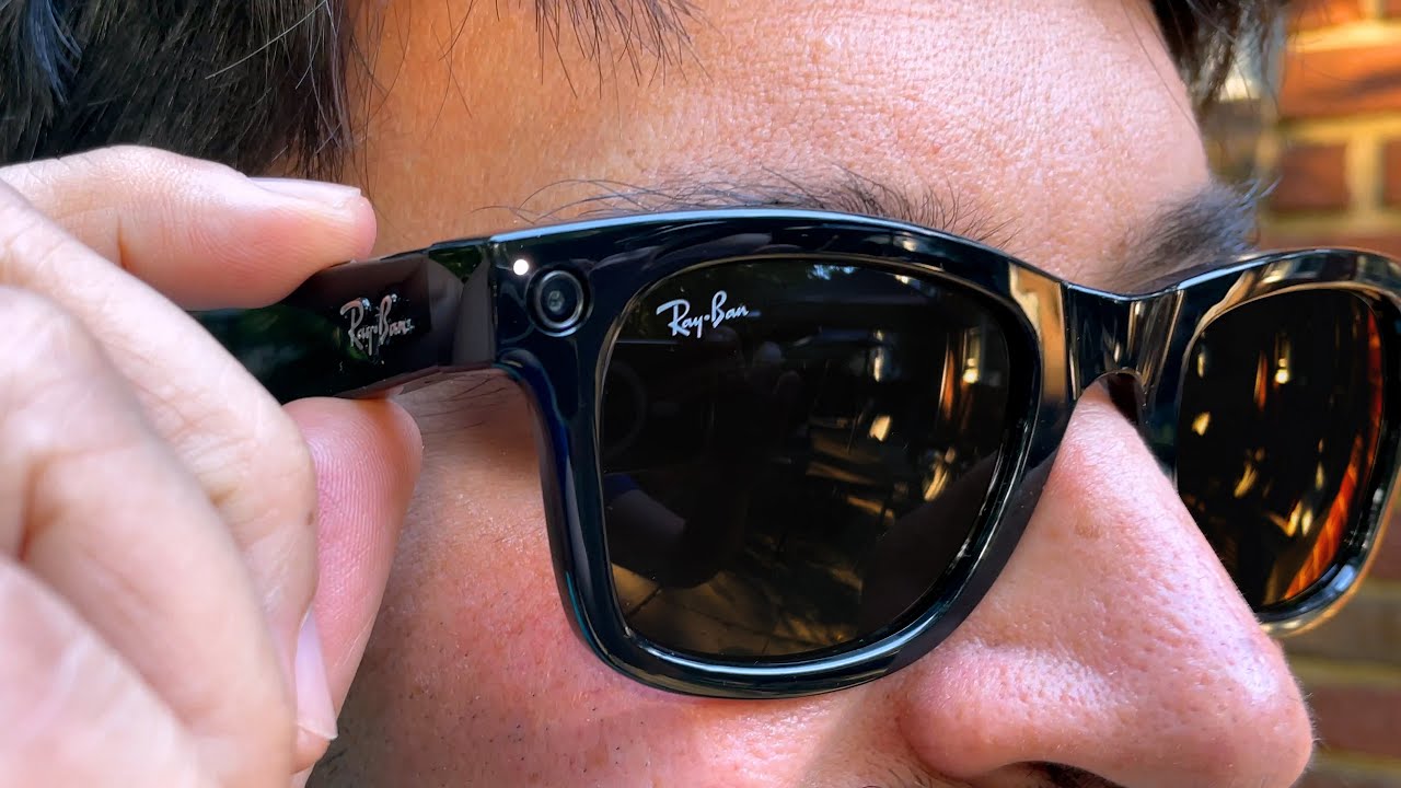
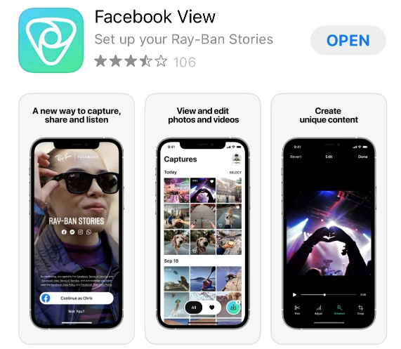
This is a story about the launch of Meta's first wearable product, Ray-Ban Stories, smartglasses co-owned by Meta and Ray-Ban, and a companion app to support the smartglasses, Facebook View.
It was the summer of 2021 and Meta was breaking new ground to release the smartglasses from the new Reality Labs division. I was a member of Reality Labs and the lead content designer on the project, responsible for both the content strategy and the UX writing.
It was the summer of 2021 and Meta was breaking new ground to release the smartglasses from the new Reality Labs division. I was a member of Reality Labs and the lead content designer on the project, responsible for both the content strategy and the UX writing.
Task
As the lead content designer for the Facebook View app, I was tasked with creating content to support:
The majority of the content was focused on the companion app because the smartglasses have no user interface (UI). This made the companion app tremendously important to both the user and the company.
The design challenge lies in creating sufficient content in the app to support the glasses, but not compete with usage of them. Research reveals that users don't expect a companion app with their smartglasses, adding to the challenge of building a mental model around using an app to support and drive use of smartglasses.
From a content perspective the main challenge of this project was to ensure the app content was lightweight and simple, to support the smartglasses, but not compete with them.
- Device set up
- Device user interface (since the smartglasses have no UI)
- Settings and ongoing support
The majority of the content was focused on the companion app because the smartglasses have no user interface (UI). This made the companion app tremendously important to both the user and the company.
The design challenge lies in creating sufficient content in the app to support the glasses, but not compete with usage of them. Research reveals that users don't expect a companion app with their smartglasses, adding to the challenge of building a mental model around using an app to support and drive use of smartglasses.
From a content perspective the main challenge of this project was to ensure the app content was lightweight and simple, to support the smartglasses, but not compete with them.

User NeedSet up, use, and manage smartglasses
|

Product NeedEasy device set up and management
|
Challenge
Craft content in app to drive device usage
|
|
Content design challenge:
Create app content that drives device usage. |
|
Facebook View app
Action
I started this project by huddling with my cross-functional team consisting of:
I followed my standard content design/UX writing process with some variations:
I started my process by circling up with the cross-functional team to clarify my role, deliverables and process and to confirm:
I captured this information in a living "content brief" document that I shared out with the team to confirm my findings.
- Lead product designer
- Sr. UX Researcher
- Sr. product manager
- Lead engineer
- Marketing lead
I followed my standard content design/UX writing process with some variations:
- Understand the user, needs, and context (Empathize)–user-research, persona, interviews
- Define the problem / user need & journey (Define)–write out the need and share for feedback
- Validate need through research
- Ideate solutions with product designer to explore solutions and flows. (Ideate)–leverage strengths of words and images
- Refine content, text, and imagery
- Prototype experience to share for feedback
- Test prototype in usability testing (Test)
- Deliver final content and documentation
I started my process by circling up with the cross-functional team to clarify my role, deliverables and process and to confirm:
- User
- User need
- User journey
I captured this information in a living "content brief" document that I shared out with the team to confirm my findings.
Users & user journey mapping
We used an existing persona that captured our three main user groups. Using this persona, I mapped the user journey in collaboration with product design, research and engineering. This was important to:
I coordinated messaging across multiple user touch points, including the Ray-Ban website, Meta site, global marketing, help sites, and the app. I created a messaging framework, content spreadsheets and a style guides to support the content and drive consistency.
- Understand the user touchpoints
- Create a narrative across touchpoints.
I coordinated messaging across multiple user touch points, including the Ray-Ban website, Meta site, global marketing, help sites, and the app. I created a messaging framework, content spreadsheets and a style guides to support the content and drive consistency.
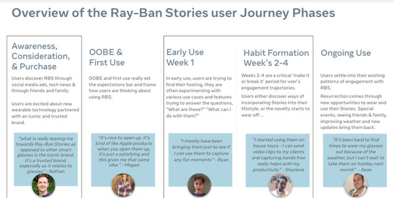
User journey
Research
To verify the user and their need, I partnered with the researcher and product manager to review
existing research ("what we know") and identify research needed ("what we don't know").
existing research ("what we know") and identify research needed ("what we don't know").
"What we know" research
|
"What we need to know" research
|
Problem statement
I identified a problem statement to verify with the team and use to guide our work.
Problem statement: Ray-Ban Stories users need an easy-to-use companion app with a simple UI to help them set up, manage, and discover new features on their wearable device.
Problem statement: Ray-Ban Stories users need an easy-to-use companion app with a simple UI to help them set up, manage, and discover new features on their wearable device.
Ideate: Massaging framework
The app needed to support anticipated messaging on new features. The smartglasses launched with core features and a roadmap of new features to launch over the first year. I created a messaging framework to address how and where we would address new features.
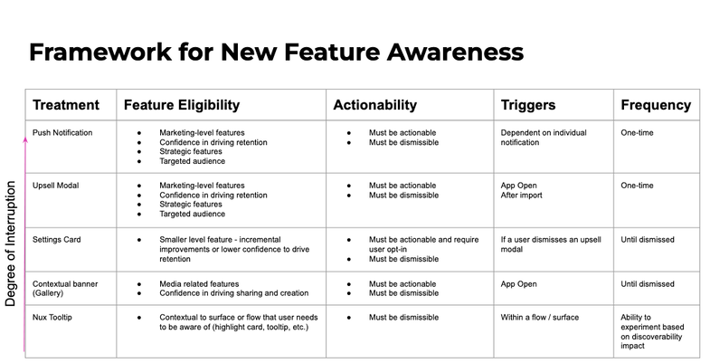
Framework
Ideate: Content strategy & content wireframe
My strategy was to keep content lean on the app and highlight features-
related content to get users out of the app and onto their wearable to
explore the new capabilities.
related content to get users out of the app and onto their wearable to
explore the new capabilities.
- Focus content around core tasks
- Ensure content is highly functional and utility-focused
- Leverage a hierarchy with content supporting the device first
- Identify and leverage specific content types
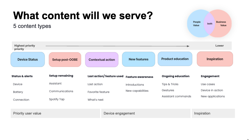
Content types
Refine: Content principles & design
Next step was to ideate on content and flows with product design in a Figma file.
Feature awareness principles
Feature awareness principles
- Engaging -- invite the user into the interaction
- Progressive -- ladder up to more challenging interactions
- Wow moments -- pepper with moments of delight and discovery
Prototype & test
The product designer and I created a prototype for user and leadership feedback.
Test in user-testing: We took the iterations into informal user research to get feedback
on whether our designs solved the user needs.
Test in user-testing: We took the iterations into informal user research to get feedback
on whether our designs solved the user needs.
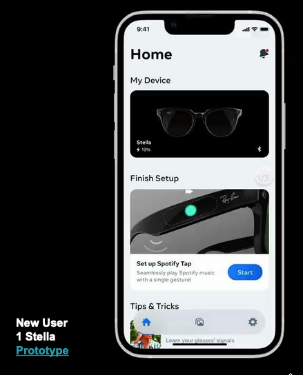
Prototype for testing
Finalize content
After iterating in the Figma design and sharing out multiple times for feedback and testing, I finalize content.
I like to finalize content outside of Figma.
Having a content document enables me to view the content as a whole and adjust the way I am speaking to the user.
I create a deliverable spreadsheet that also includes string descriptions and internationalization notes.
Content goals:
I like to finalize content outside of Figma.
Having a content document enables me to view the content as a whole and adjust the way I am speaking to the user.
I create a deliverable spreadsheet that also includes string descriptions and internationalization notes.
Content goals:
- Simple -- improve ease of use with familiar, easy-to-understand language
- Straightforward -- essential information and necessary words
- Human -- conversational, empathetic tone and writing
Results
We launched with a functional app that prioritized the primary device use
cases of setting up, using, and managing the app. Data:
The launch was a success. As we launched more features, we leveraged secondary content (optional to the experience) to engage users and help them discover expanded capabilities of the smartglasses.
Eventually it became obvious that we needed to substantially increase content to support our new features and capabilities. You can view my work leading feature awareness and user education here.
cases of setting up, using, and managing the app. Data:
- Positive user feedback
- High usability scoring (testing users navigating core needs)
- Low time on screen (efficient task screens)
The launch was a success. As we launched more features, we leveraged secondary content (optional to the experience) to engage users and help them discover expanded capabilities of the smartglasses.
Eventually it became obvious that we needed to substantially increase content to support our new features and capabilities. You can view my work leading feature awareness and user education here.
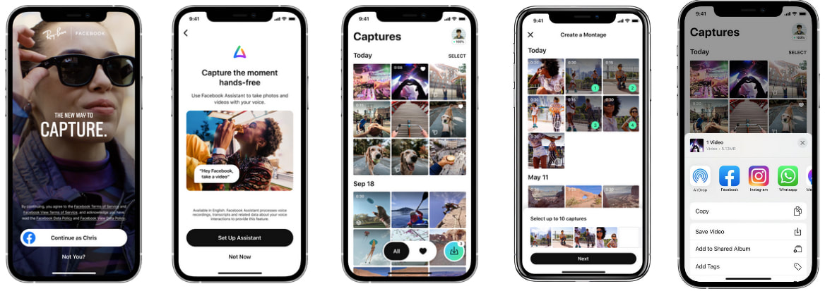
New user experience
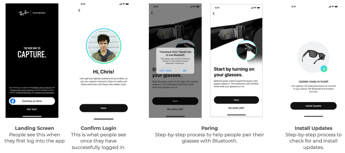 New user flow