Overview
I led an initiative at Meta to create an interactive product tour after user data revealed
a lack of awareness of core features on our smartglasses.
The product tour increased product awareness by 9% and user education content by 35%.
a lack of awareness of core features on our smartglasses.
The product tour increased product awareness by 9% and user education content by 35%.
Situation
|
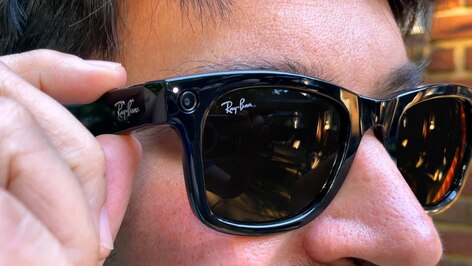
Summer of 2022, four months into the launch of Meta's flagship wearable, Ray-Ban Stories smartglasses.
Everything on track until...
Problem: The glasses were selling, but retention was at risk if we didn't have a way to educate users on features. My goal was to create an interactive product tour to offer new user and continual product education. |
|
Action
 Existing content
Research
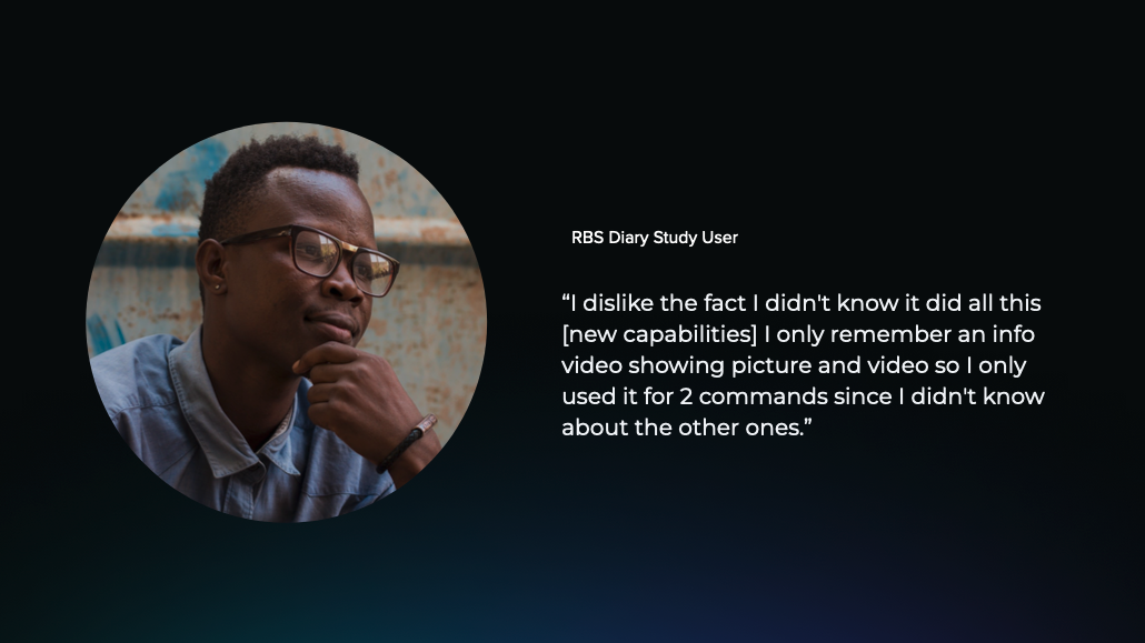
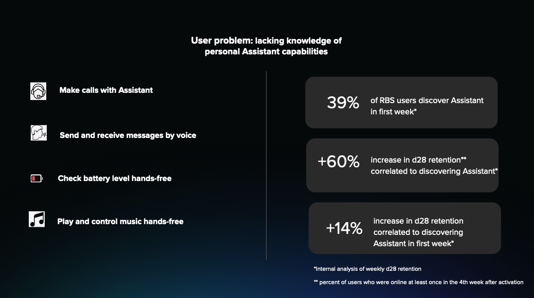
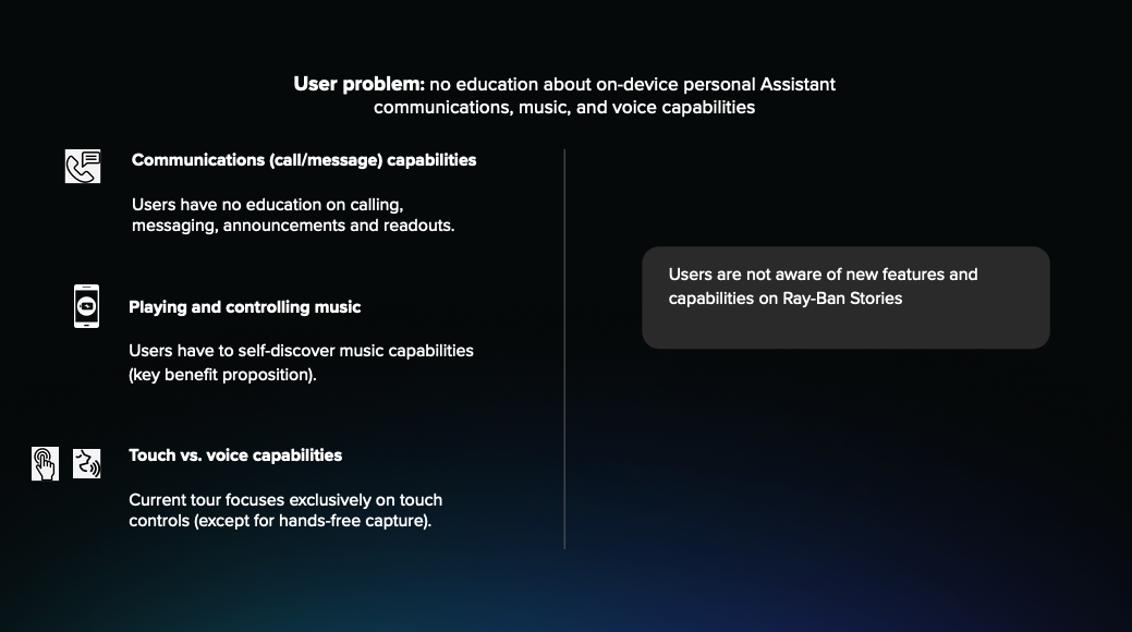
I partnered with UX research to understand the data. The data was strong, but...
Obstacle #1: There was no project on the roadmap to address feature education
I solved this problem by:
I created a presentation to convince product to add the project to the roadmap.
Goals and requirements (+ Success metrics)
I partnered with Product to discuss KPIs and product requirements and Engineering to understand what they would support.
Obstacle #2: Expectation for quick fix from marketing
Solve:
Partnered with:
I partnered with UX research to understand the data. The data was strong, but...
Obstacle #1: There was no project on the roadmap to address feature education
I solved this problem by:
- content audit of existing feature education
- identify gaps
- build consensus on need to address
- align cross-functional team (UX writer (me), Product designer (PD), UX researcher (UXR), Product manager (PM), Design program manager (DPM), Engineering (Eng)
I created a presentation to convince product to add the project to the roadmap.
Goals and requirements (+ Success metrics)
I partnered with Product to discuss KPIs and product requirements and Engineering to understand what they would support.
Obstacle #2: Expectation for quick fix from marketing
Solve:
- audit content of marketing's feature ed outside of app
- pull research/data on how external marketing working (poorly – relied on search, but users can't search for what they don't know)
- share findings with product and marketing
Partnered with:
- Product to discuss steps to add project to roadmap
- Engineering to discuss LOE of my ideas and their work schedule
- DPM to align on design roadmap
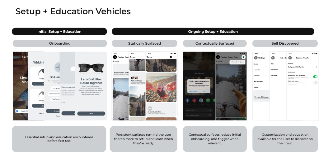
Initiating a project
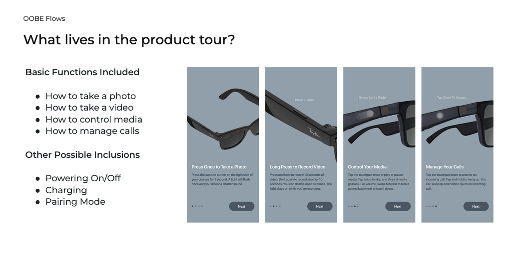
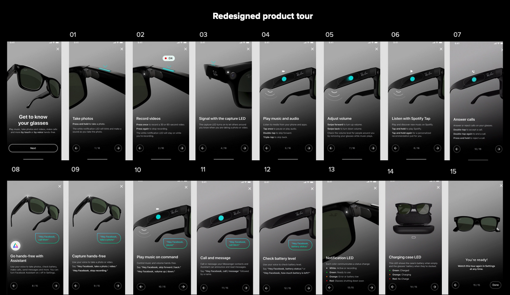
Strategy: IN-APP feature education project, including:
Strategy: IN-APP feature education project, including:
- In-app contextual user education (link to project)
- In-app user education evergreen space (link to project)
- Interactive product tour (this project)
Obstacle #3: Product and engineering questioned impact of a product tour, so I shared
my vision of a tour used for both onboarding AND product education, with ingress points
on 10+ screens (set up, video first use, calling first use, Spotify music screen, Bluetooth,
and battery and camera settings.
I estimated a 4% conversion rate from these ingress points based on traffic from CTA's on
similar pages. Product and engineering were satisfied.
Process
This is the UX writing process I used for this project. I like to leverage design thinking to align UX writing with product design.
I also find a familiar process helps the cross-functional team understand and reinforce the UX writing/product design collaboration.
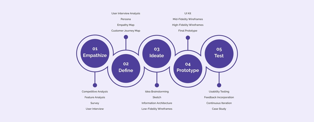 User-centered design / design thinking
1. Understand the user, needs, and context
2. Define the user problem & share for feedback
3. Validate need through research
4. Ideate solutions with product design
5. Refine content, text, and imagery
6. Prototype experience to share for feedback
7. Test prototype in usability testing
8. Deliver final content and documentation
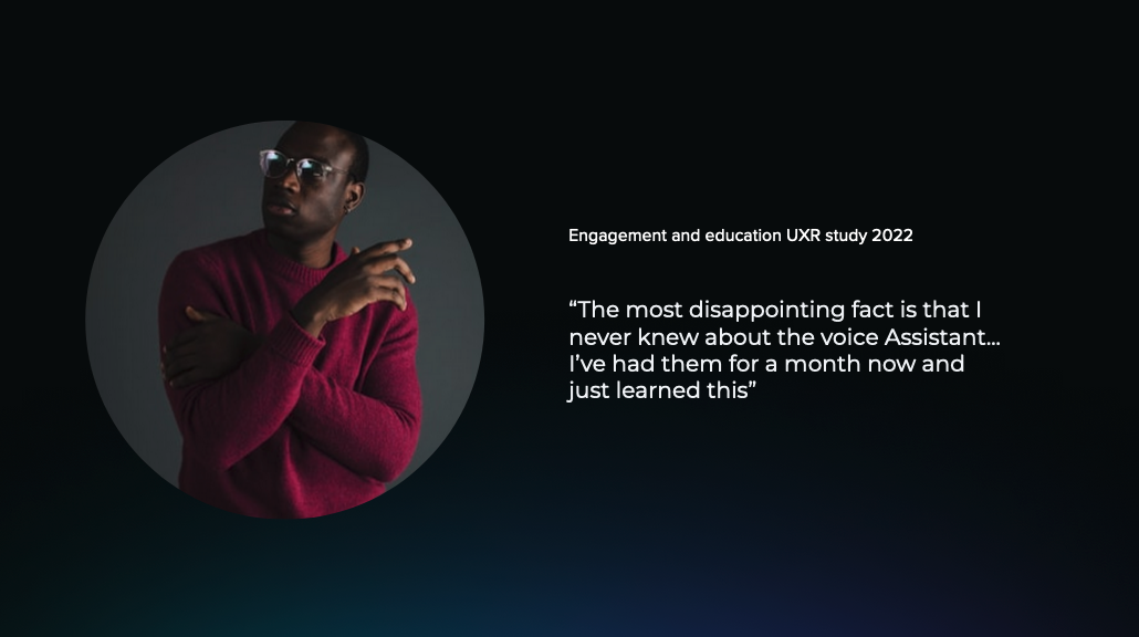
Understand user and need
I collaborated with the UX researcher to gather key testimony and request ongoing user testing.
I collaborated with the UX researcher to gather key testimony and request ongoing user testing.
|
|
Define need
To boil down the need, I created a persona, landscape/empathy map and identified touchpoints along the customer journey.
To boil down the need, I created a persona, landscape/empathy map and identified touchpoints along the customer journey.
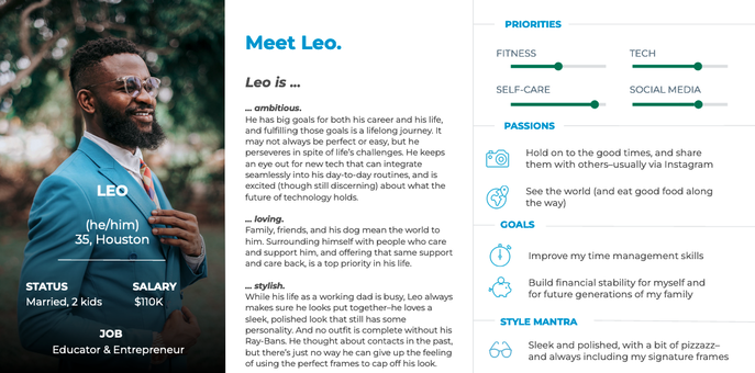
User persona
User landscape
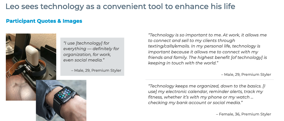
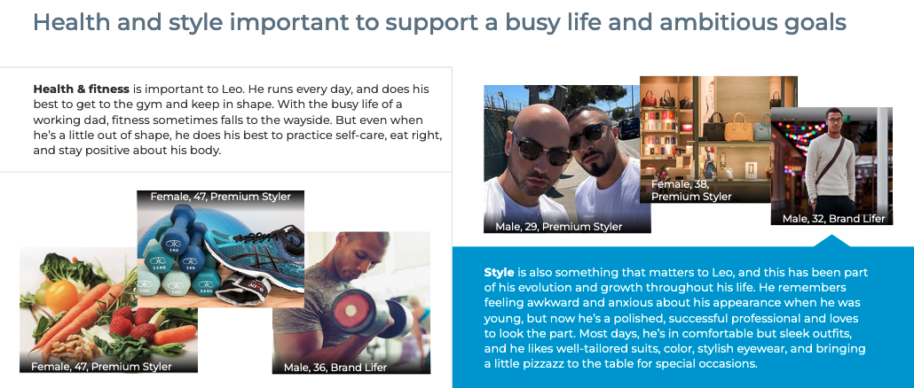
Partner with UX research to understand how the product is used.
Partner with UX research to understand how the product is used.
|
|
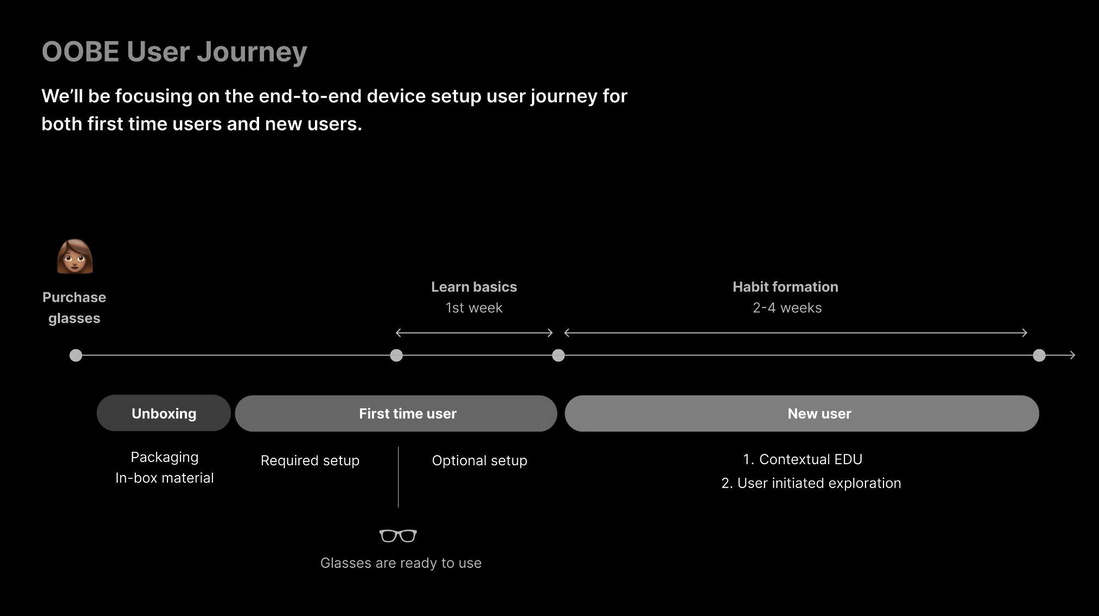
Journey map
Partnered with product designer to:
- create a journey map
- identify touchpoints for ingress to user ed
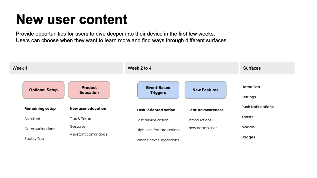
Triggers and surfaces
Identify content Leo will see in his journey.
Identify content Leo will see in his journey.
Problem statement
Defined with data.
Defined with data.
- Problem statement: How do we raise awareness of new features and offer ongoing product education?
- User story: I want to be aware of all new features of the smartglasses and have an easy way to learn how to use them.
|
|
|
Ideate solutions
Partnered with designer to explore solutions, IA, flows and testing.
Sketch user flow We used Figma to sketch screens with current text. |
Identifying potential content
|
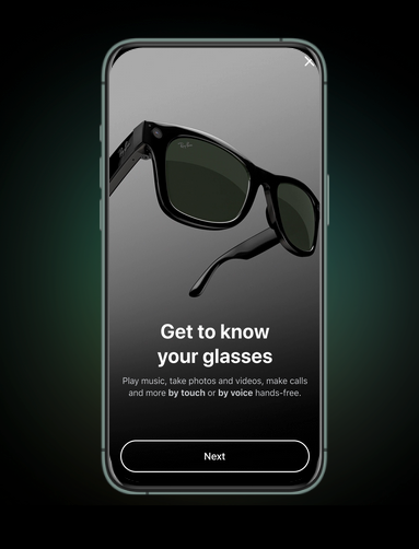 Prototype
Prototype for feedback and testing
Brand and voice
Ray-Ban Stories brand is about the excitement and aspiration of wearables tech.
- Voice personable & engaging with simple words to build confidence
- Tone (for context of tour): informative and encouraging
Test with real users
Partner with the UX research, product and design to test prototypes on users.
Testing results:
I addressed length and cognitive load by:
Partner with the UX research, product and design to test prototypes on users.
Testing results:
- users felt informed and educated (and retained knowledge)
- liked ability to deep link
- some felt it may be a little long during setup
I addressed length and cognitive load by:
- combining & cutting screens
- partnering with engineering to enable linking to specific screens (not consecutive)
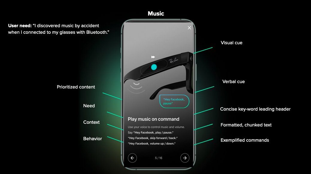
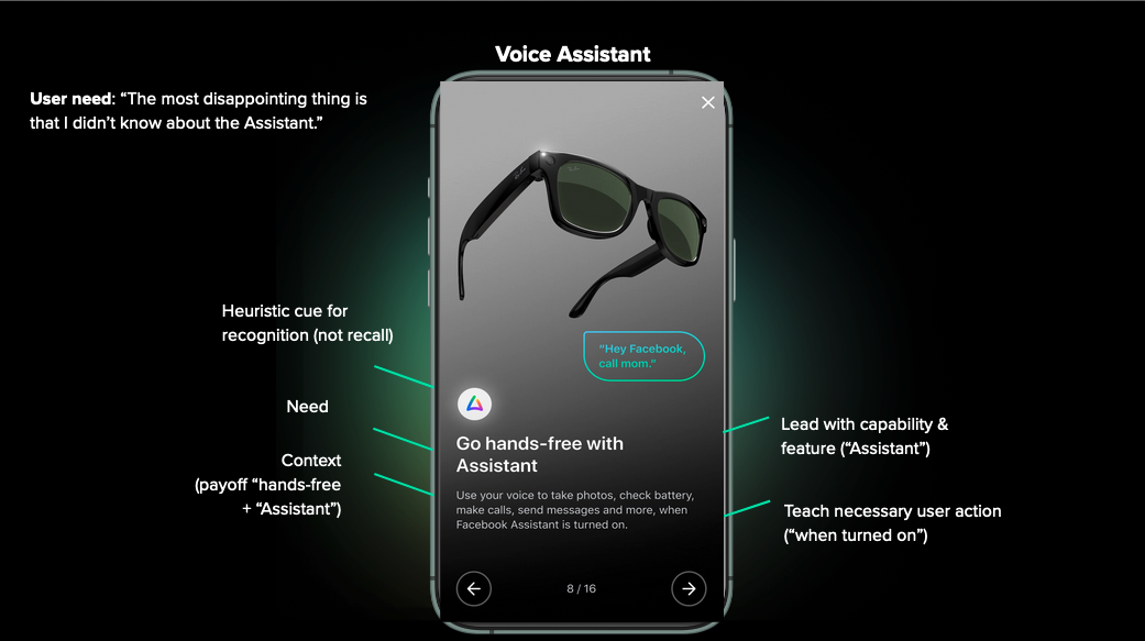
UX/UI Writing approach
Consistency goals
Microcopy goals
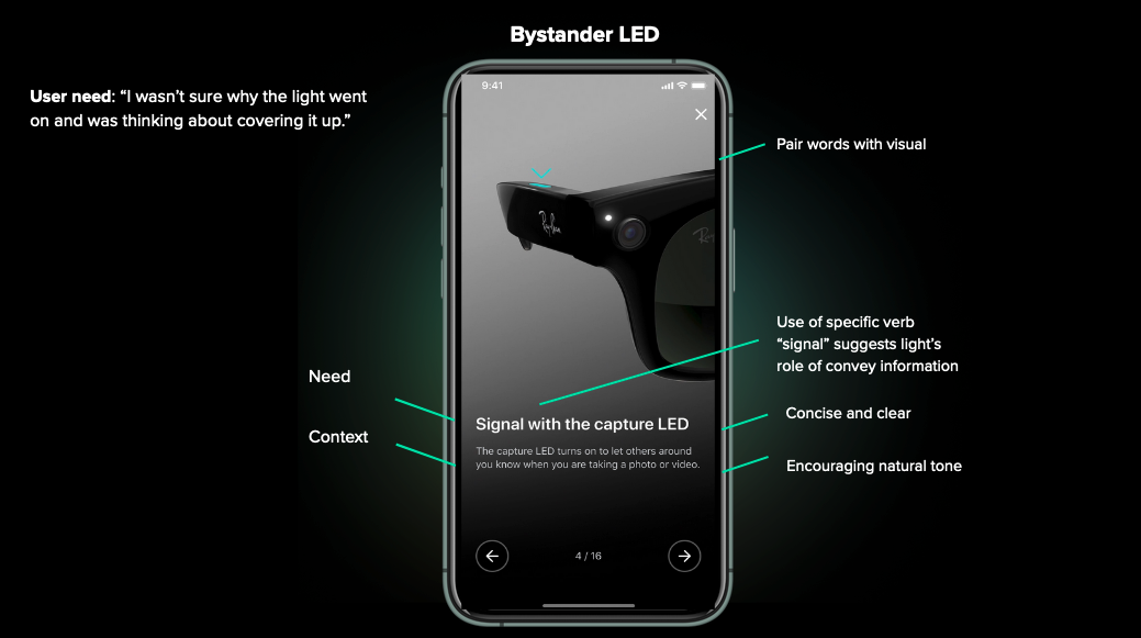
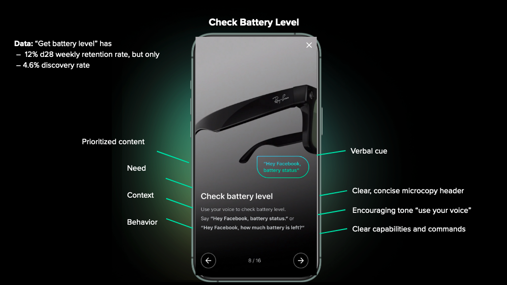
- Visual, scannable, digestible, single-topic screens
- Show user interaction, describe need, context and behavior
Consistency goals
- Lead with user need/purpose of feature
- Follow with the context
- Close with user behavior/command
Microcopy goals
- Clear, concise text
- Pair words with visuals (show don't tell)
- Be conversational (human)
- Front load value and lead with action verb (e.g. "Use your voice")
- Format (style, chuck) for scannability (new & existing users)
- Exemplify usable voice commands
Results
What I learned
This project was one of 3 user education projects I spearheaded. I trusted my instincts that told me:
- 9% increase in product feature user awareness, measured by feature usage
- 35% increase in feature user education content, measured by total user ed content in app
- 8.5% average conversion on contextual ingress links
What I learned
This project was one of 3 user education projects I spearheaded. I trusted my instincts that told me:
- user education made the app more valuable to users
- product education leads to device usage
- pairing microcopy with visuals makes for impactful screens